Whipped Wonder, founded by pastry chef Jane in 2010, has grown from a passion project in her home kitchen to a well-loved dessert brand in the local community. It has become a success story and inspiration for all small businesses in town. Known for its signature flavours and high-quality desserts, the brand now caters to multiple events and also sells its products in select retail locations locally.
As a brand identity designer, I aimed to create a cohesive, memorable, and appealing visual identity for Whipped Wonder which reflected Jane's journey, core values, and brought deserving attention to her delicious offerings.
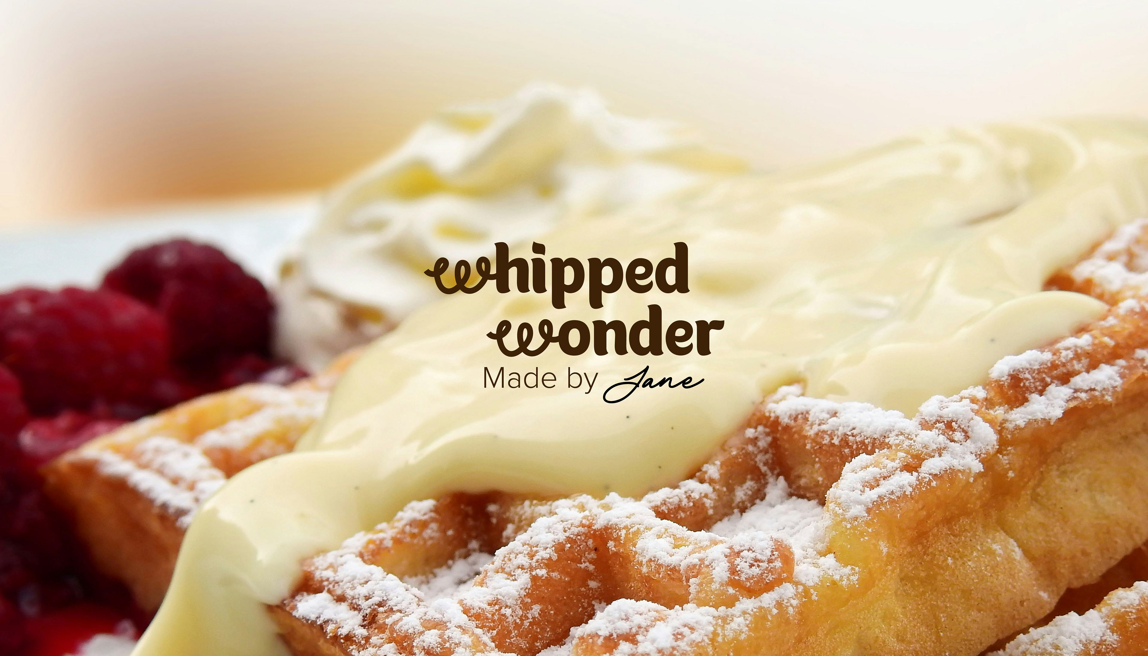
Brand Voice: Warm, inviting, and playful, with a touch of elegance.
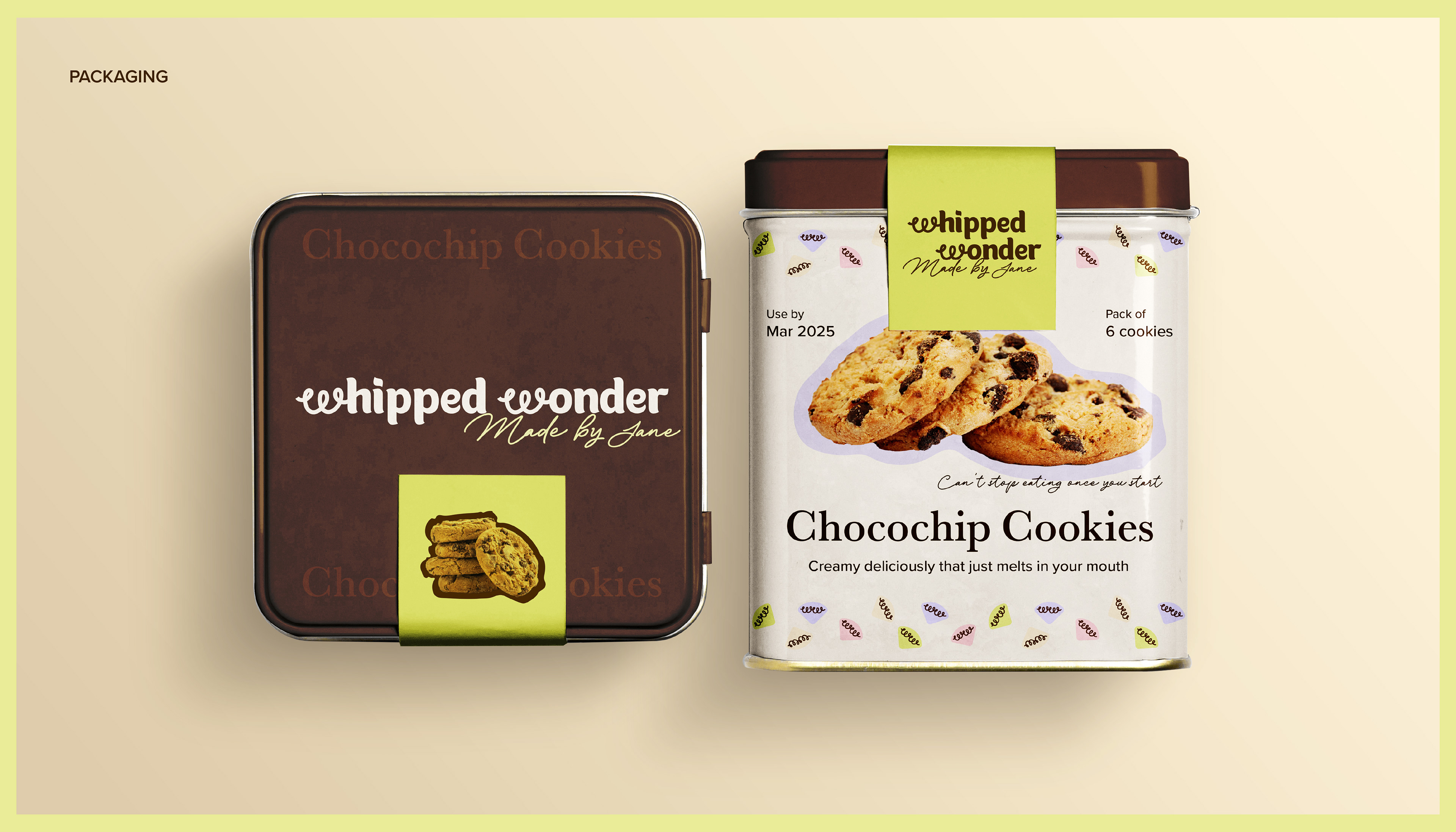
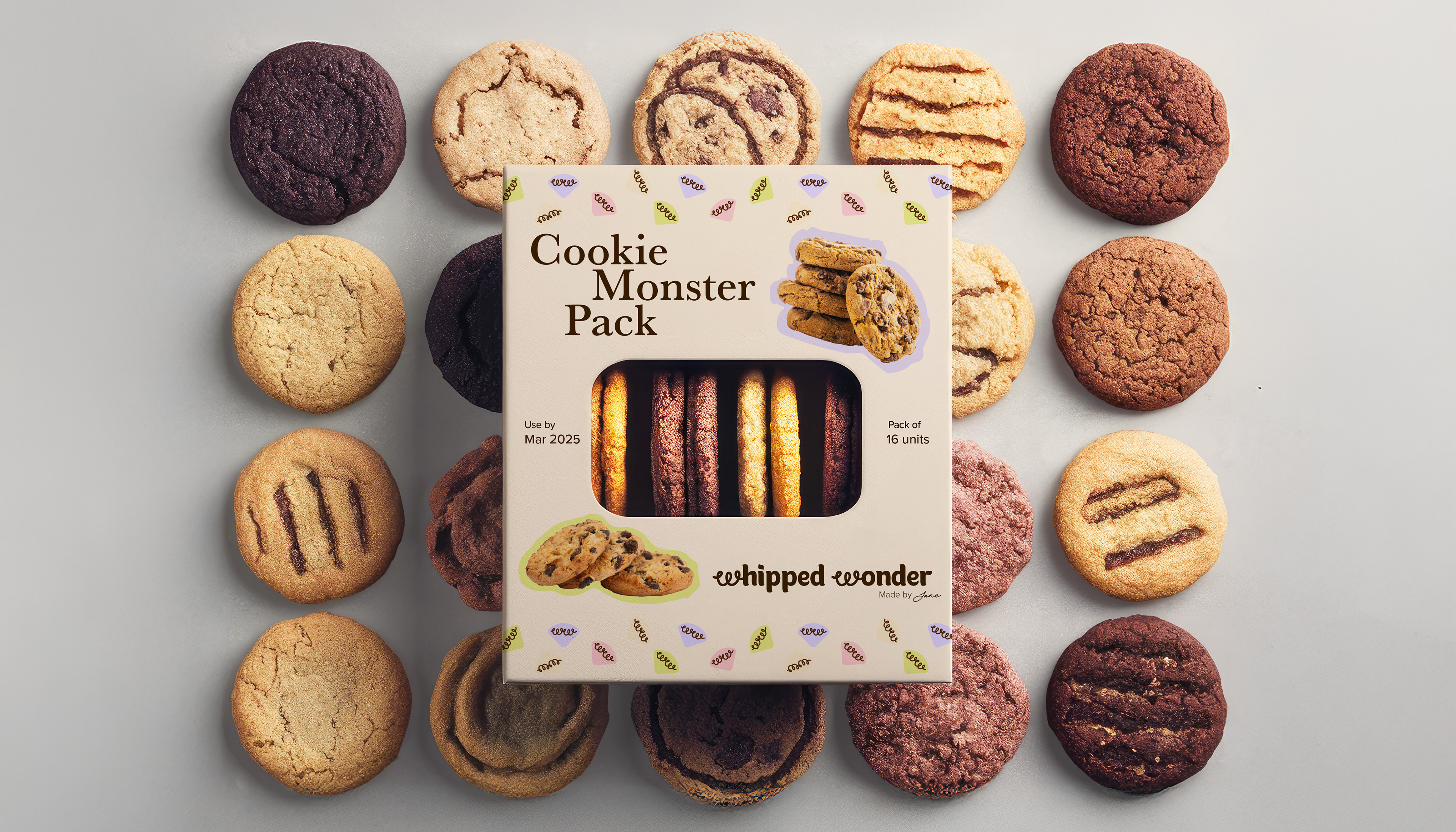
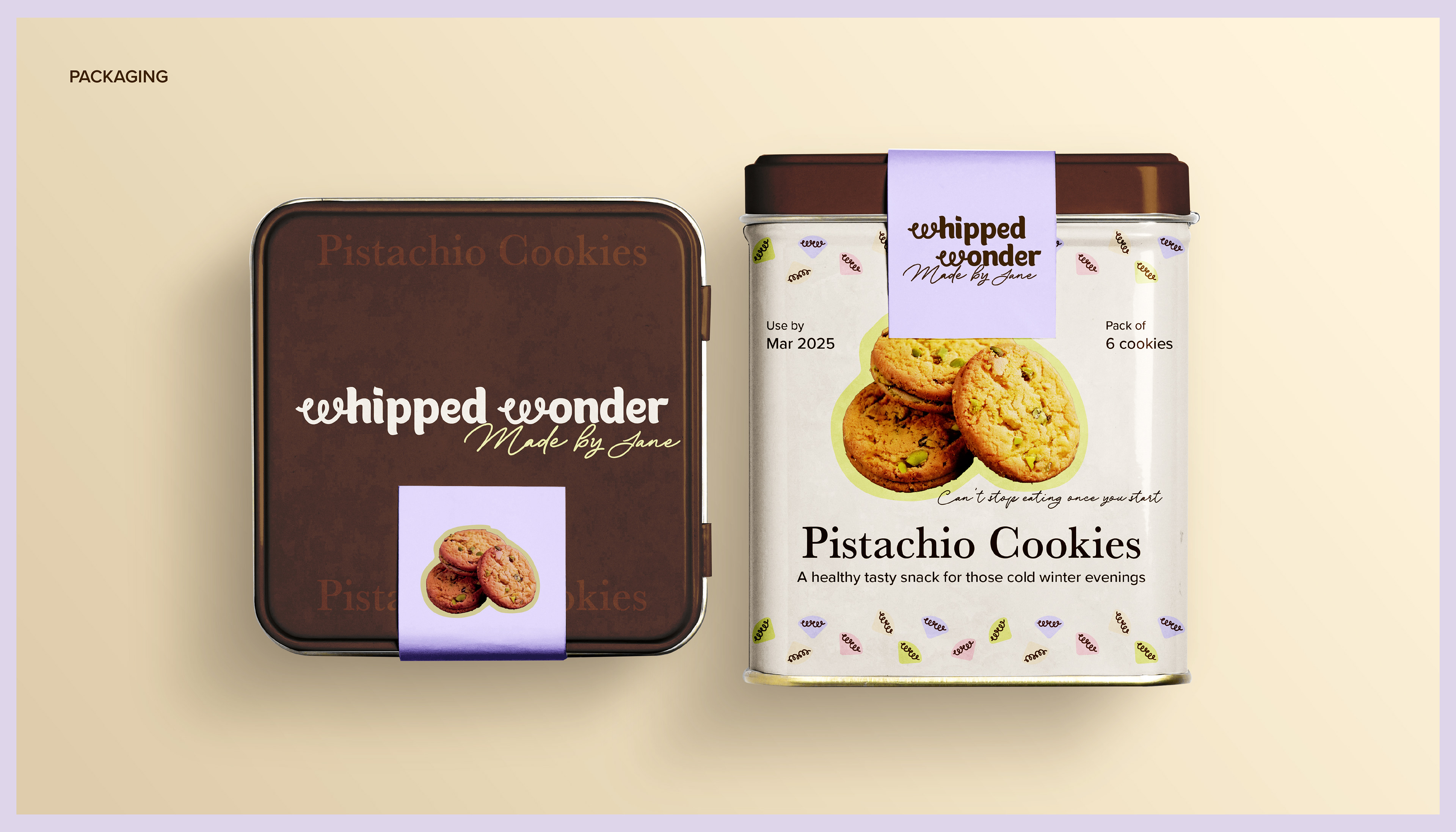
Color Palette: Soft pastels (e.g., blush pink, creamy beige) with pops of vibrant, dessert-inspired hues like berry or caramel.
Typography: Combination of whimsical, script-like font paired with clean sans-serif for modernity and clarity.
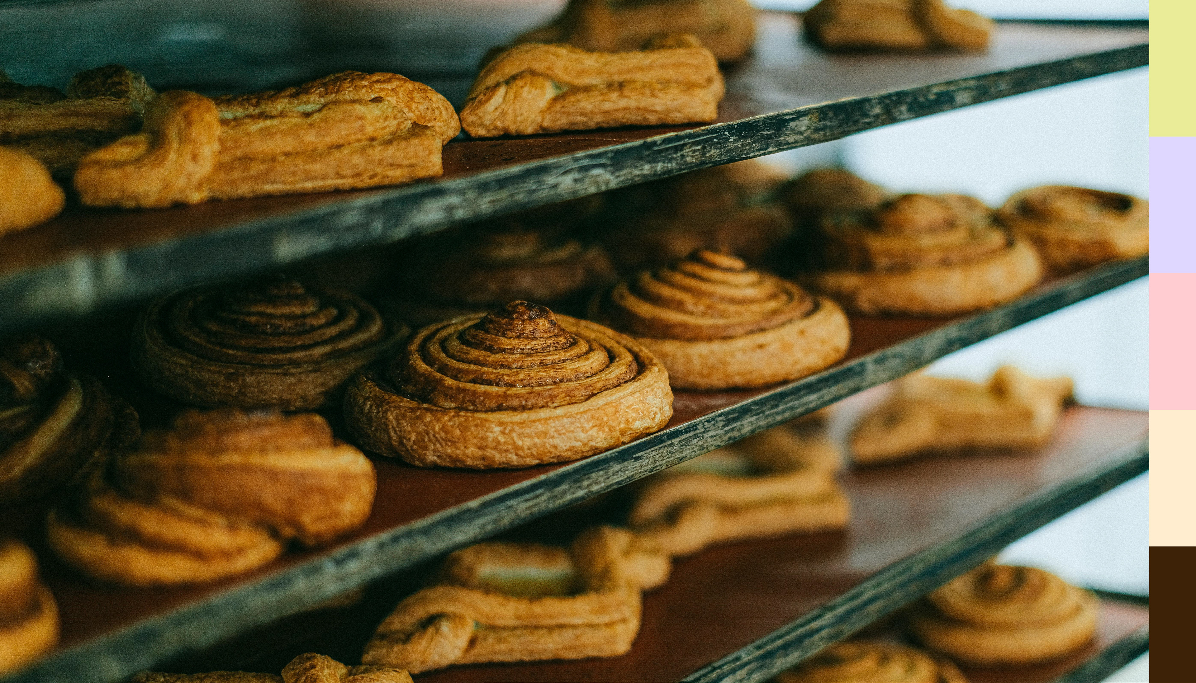
Imagery: High-quality, close-up photography of desserts, behind-the-scenes baking moments, and happy customers.
Founded in 2010 by pastry chef Jane, Whipped Wonder began in a humble home kitchen. Jane's passion for crafting delectable desserts led her to experiment with recipes and fresh ingredients, eventually perfecting her signature flavors.
Encouraged by glowing feedback, Jane turned her passion into a business. What started small quickly became a beloved local brand, delighting customers through catering and select retail locations.

After extensive trial and refinement, we finalised a color palette that captures both Jane's vibrant personality and the delicate essence of her desserts. While we knew we wanted a soft palette, the hues were carefully selected to reflect Jane’s signature flavors from her best-selling recipes. This thoughtful approach ensured a cohesive visual identity that resonates with both new and existing customers.
Beyond aesthetics, the palette plays a key role in brand recognition. By tying colours to flavours, we created an intuitive connection between the visuals and the product experience. The result is a brand that feels warm, inviting, and instantly familiar—just like Jane’s desserts.
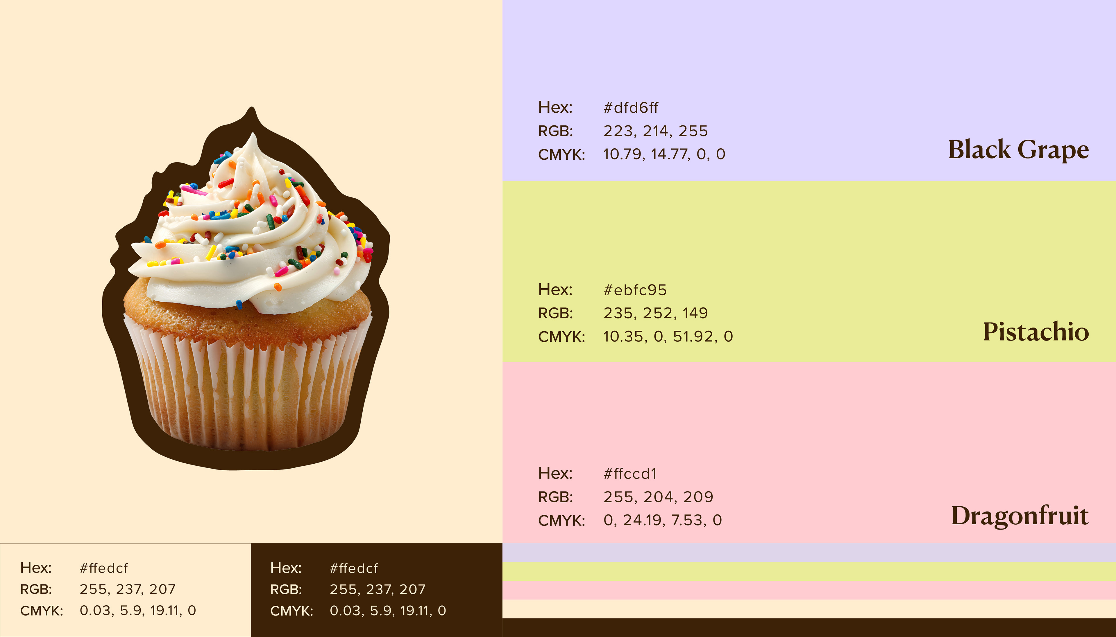

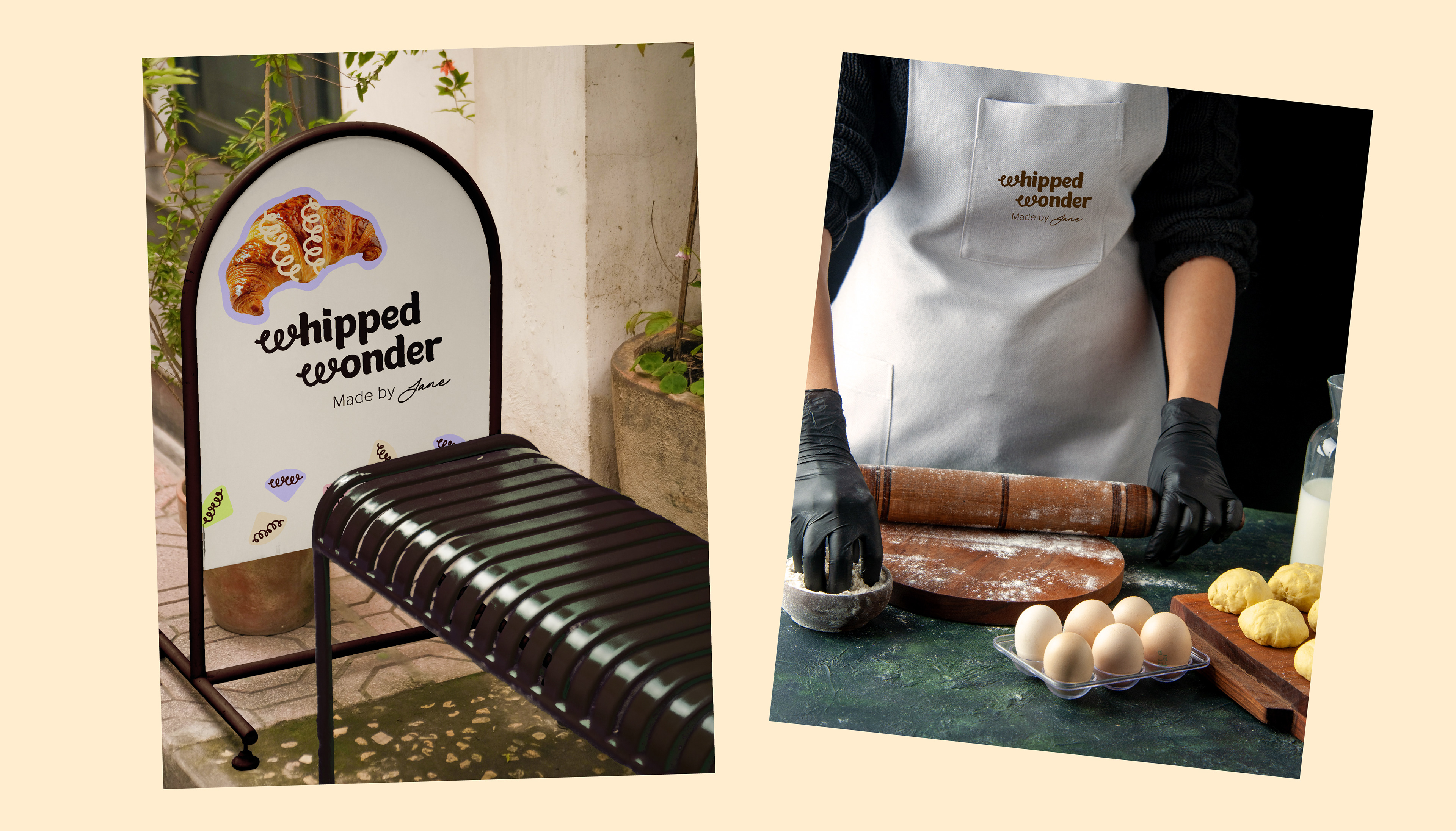
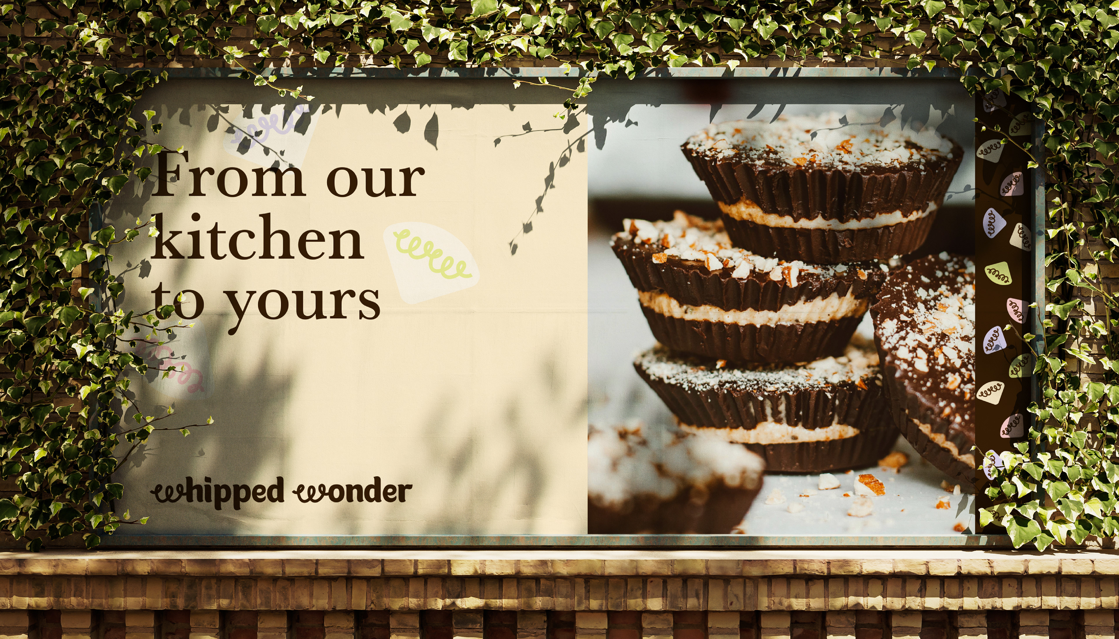
Color is a key element of Whipped Wonder’s identity, and I wanted to ensure that every brand asset featured a distinctive pop of color, making them instantly recognisable as Jane’s signature style. By integrating the soft pastel brand palette throughout the design, we created a visual language that not only reflects the brand’s personality but also reinforces its presence across different touch points.
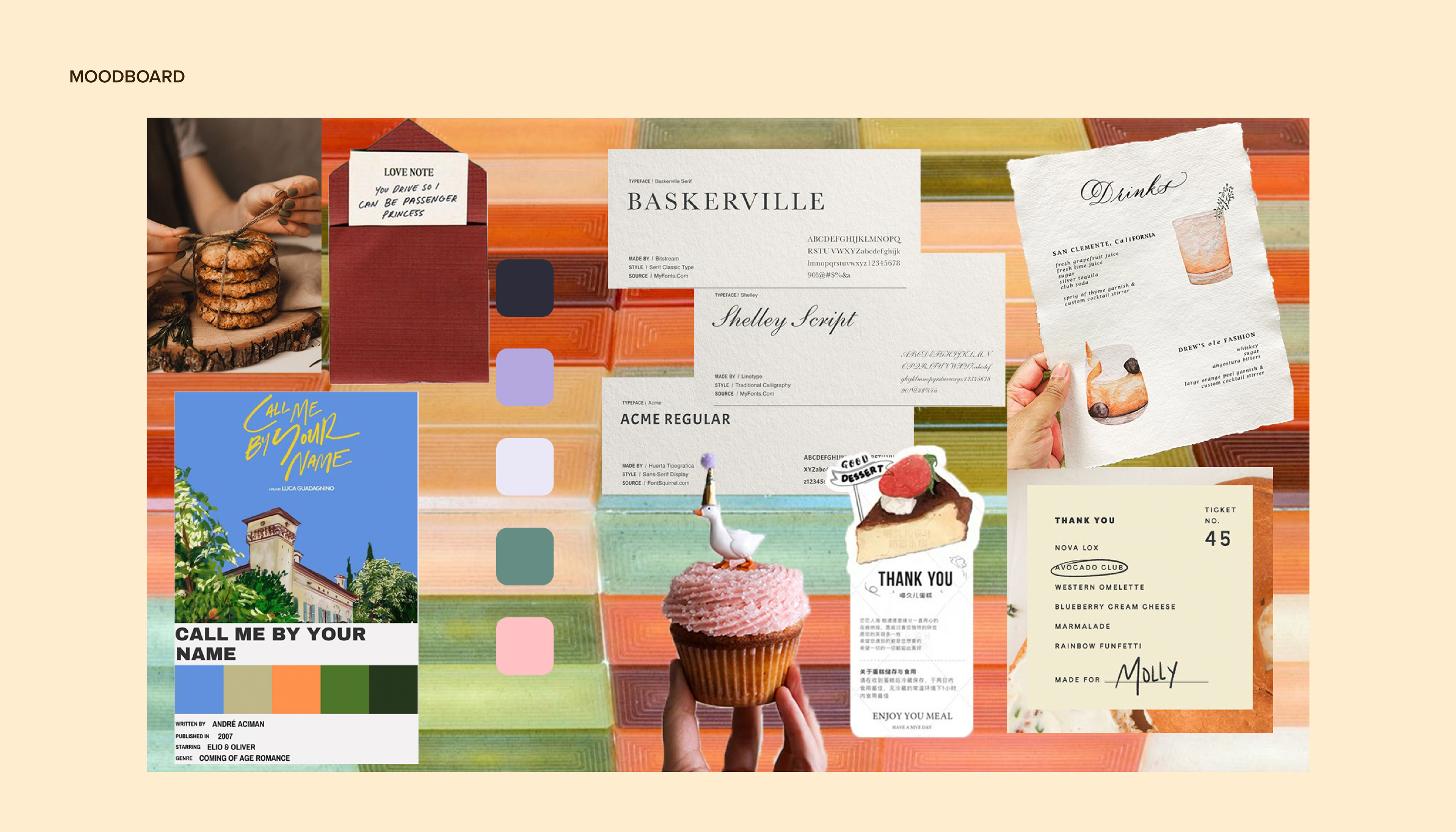
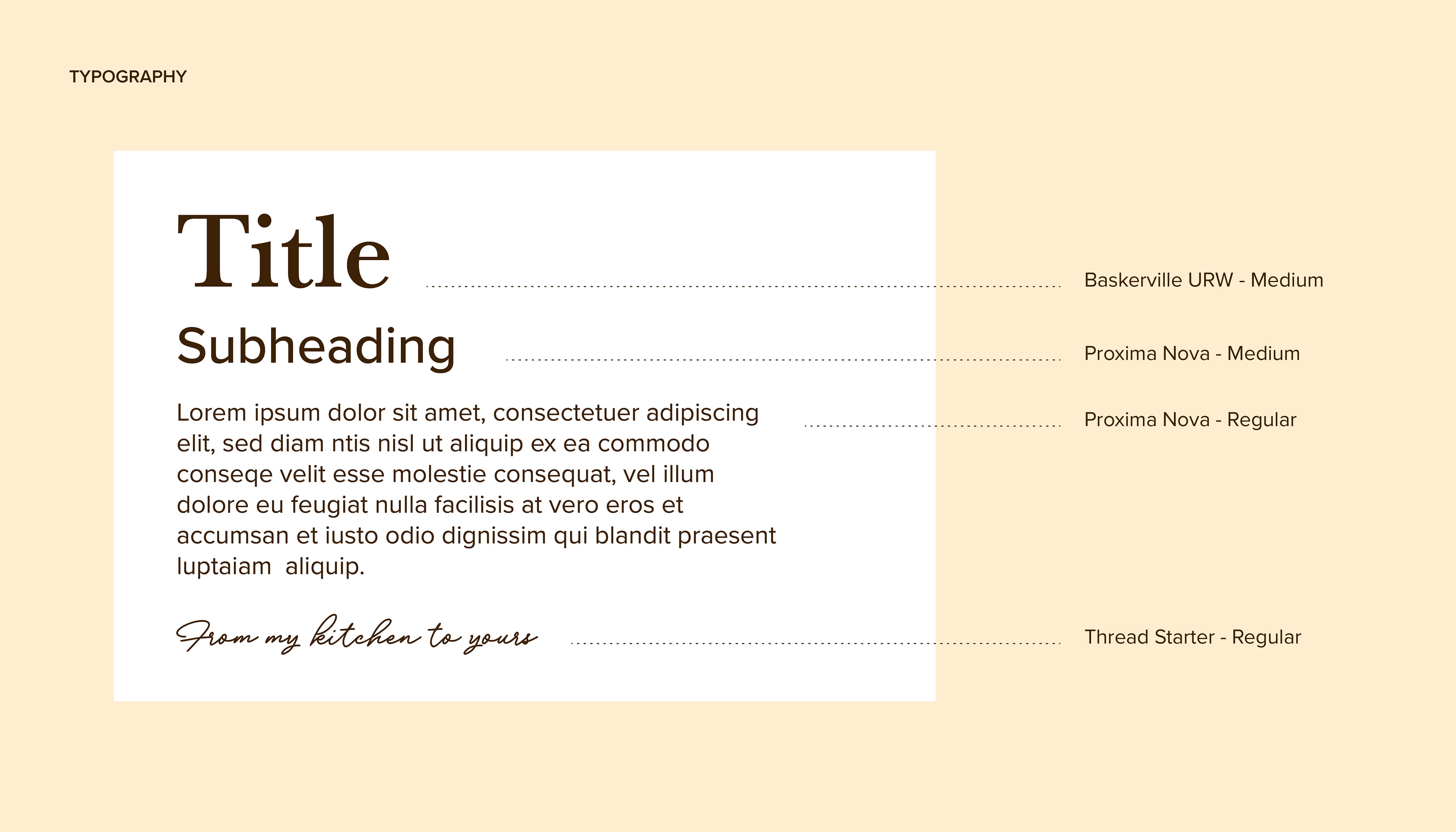
When selecting the brand typography, I kept the target audience at the forefront of my decision-making.
Primary: Dessert enthusiasts (ages 25–45, primarily women) who appreciate premium, handmade treats for personal indulgence and gifting.
Secondary: Event planners and caterers looking for sophisticated, high-quality dessert options.
Secondary: Event planners and caterers looking for sophisticated, high-quality dessert options.
Keeping this in mind helped me assess the practical applications of each typeface. With a brand like Whipped Wonder, it’s easy to lean into overly whimsical typography, but staying focused on the audience ensured a refined and balanced approach.
I ultimately chose Baskerville for titles, bringing a sense of timeless elegance, Proxima Nova for subtitles and body text to maintain readability and modernity, and Threadstarter as an accent typeface to add a touch of personality without overwhelming the design.
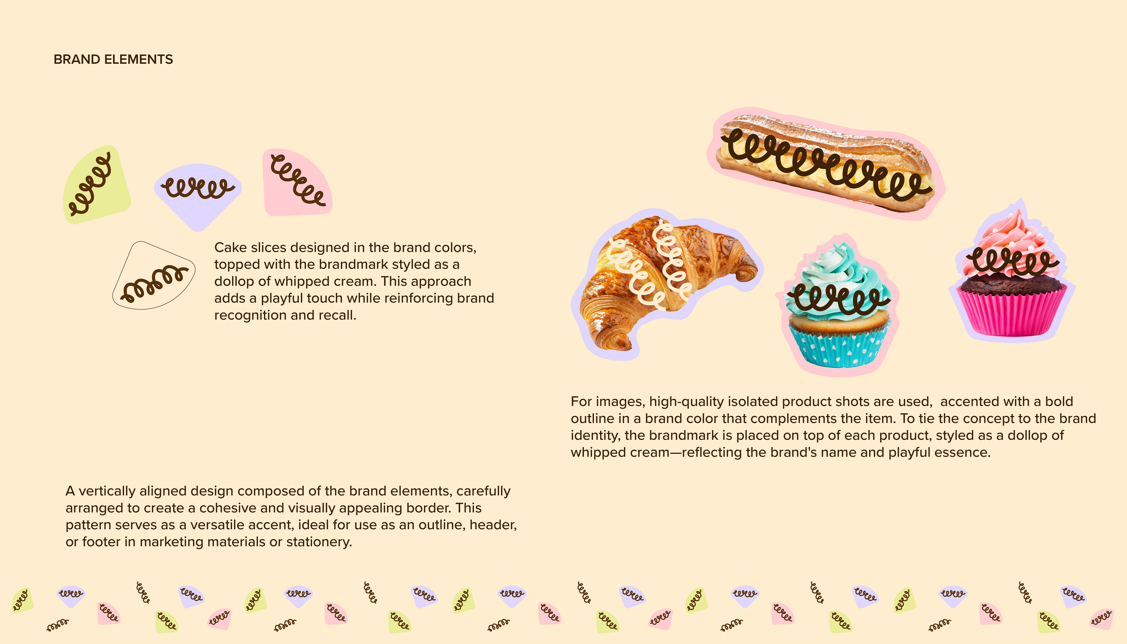
Customised brand elements and patterns play a crucial role in building a strong, cohesive brand identity. They go beyond just a logo, helping to create a distinctive and memorable visual language that reinforces brand recognition and can help a brand stand out among its competitors.
For Whipped Wonder, we developed a unique brand pattern and illustration style that not only reinforces its personality but also serves as a guide for future designs, ensuring consistency across all mediums.
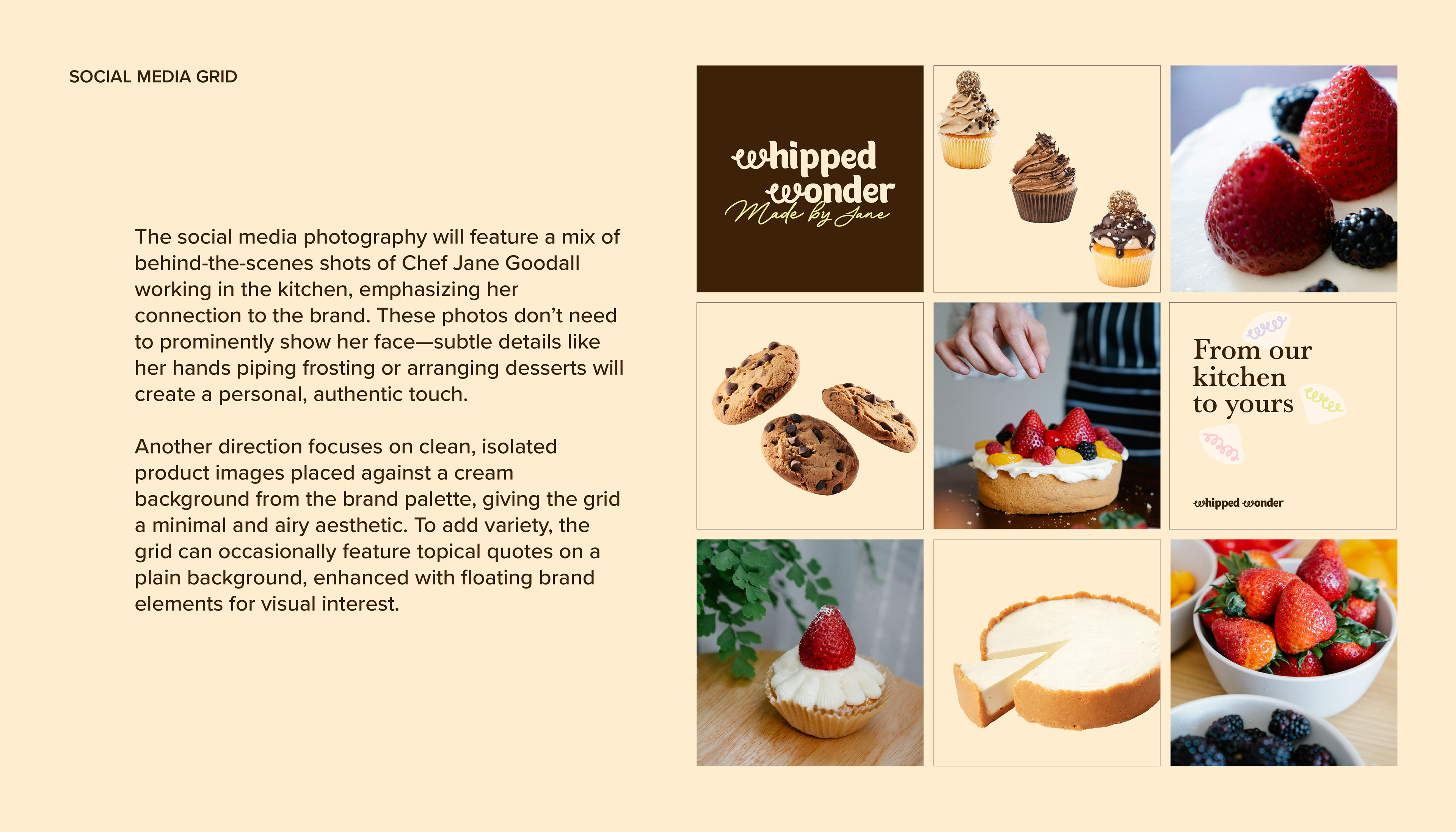
Social media can often be more helpful in telling a brand story than the product itself. Both feed into each other. To make the brand come alive through social media, we decided on the following creative direction.
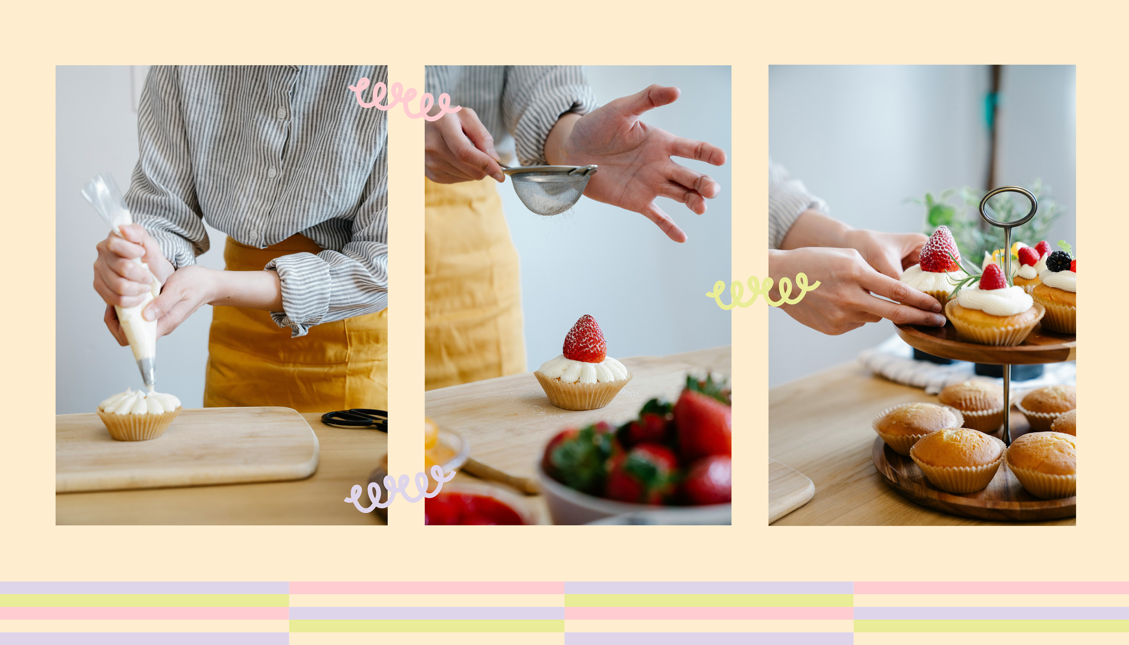
Behind-the-Scenes Photos: Show Chef Jane Goodall in action to build a stronger connection between the brand and its creator. Focus on subtle, engaging shots like her hands piping frosting, whisking batter, or arranging desserts, rather than direct portraits.
Clean Product Images: Use isolated product shots on a cream background from the brand palette to create a minimal, airy look.
Credits:
Pexels | Freepik
Project: Whipped Wonder - A Local Patisserie
Industry: Food and Beverages
Want to collaborate or work with me?
Reach out at lastmondaystudio@gmail.com
Drop a hello on Instagram
© lastmondaystudio@gmail.com | All Rights Reserved